Preparing for BFCM 2021: How to find where money leaks from your Shopify store?
The best time to prepare for BFCM is at the end of the previous shopping season. Then you should do a recap and see what stopped your store from making more money. That's why my top tip for BFCM 2021 is to patch your shopping funnel leaks before you start driving more traffic to your site.
Why focus on patching the leaks?
1) During the weeks leading up to BFCM you’ll be paying a lot for ads to get in front of new customers.
2) Every store has leaks in their funnel.
From 1 and 2 follows that a part of your expensive traffic (actually a big part) will be wasted.
You can increase your conversion rate and maximize the impact of your ad spend by patching these leaks. But you must find them first.
For that you can use the data you’ve got in Google Analytics. Analyzing it in the way detailed below will help you see where the leaks are. Then you can have a developer fix them.
What follows is a detailed guide to finding money leaks on your store. But first,
What is the magnitude of opportunities that you can uncover?
Embarking on such a data deep-dive makes sense only if you know you are going to find something valuable on the other side. Doesn’t it?
As an optimization consultant, half of my time is spent analyzing data (most of the times from Google Analytics). I even have a service around it, called DataTranslation. It does what the title says—translatates data into meaningful insight for Shopify store owners. The sole purpose — to uncover revenue improvement opportunities. This guide is the blueprint for that service.
And to show you something worth diving for, here are the findings from a recent project I completed.
Context
The client was a Shopify store owner based in the UK. They produce and sell their own brand of luxury clothing and accessories. Selling accross UK, Europe, UAE and Japan.
Their store makes about £120,000 per year, which is way below the expectations of the owner. As he told me in our initial conversation “Opening up and running an online store turned out to be more headache and less revenue than I expected. ”
The opportunities for improvement discovered are about £70,000 per year. That’s almost 60% increase, if the store owner follows through with the advice. Here are the areas that would get the most impact in that case:
- Retention Help traffic from high-volume, low-converting channels come back (as returning visitors convert more, at a higher average order value) potential gain of about £34,000 per year
- Visitor uncertainty Provide missing information upfront and help people browse easier (reducing friction in the shopping-to-obtaining process opens up the doors to impulse and repeat purchases) potential gain of about £24,000 per year
- Technical issues Fix per-browser bugs and speed issues (more causes for friction that kill the shopping desire in visitors) leaking around £18,000 per year
You’ll see how they were discovered and evaluated later in this guide.
So no wonder that merchant is having headaches—trying to grow a store with such funnel leaks is as pleasant as going down a children’s slide covered with gritty sandpaper.
Based on my observations and experience, discovering opportunities for improvement in the range of 30 to 60% is not uncommon. But how could you do that for your store? Read on to learn more!
A Shopify store owner’s guide to finding money leaks
Table of contents
- 1. Focus on the right data set
- 2. How to spot outliers in the sea of data?
-
3. Start looking at specific reports to answer important questions
- Visitors on which platform leak money the most? Mobile, desktop or tablet?
- Through which mobile browsers the store leaks money the most?
- Through which mobile devices the store leaks money the most?
- 💸 Quantifying opportunity: How much revenue is leaking through the different devices actually?
- Are top money-leaking devices underperforming because of poor site speed?
- Sidenote: Compiling a list for device testing
- Which are the most problematic pages that need to be checked on the leaking devices?
- Which visitor acquisition channel leaks money the most?
- Which user type leaks more revenue?
- How does the conversion rate of returning visitors differs from new visitors?
- 💸 Quantifying opportunity: How would the store‘s revenue improve if just 10% more people came back to the website?
- At what step of shopping behavior do most of the visitors stop?
- Sidenote: Why can’t we go deeper than that?
- Bonus: Causes for funnel step abandonment
- 💸 Quantifying opportunity: How would the revenue improve if abandonment in the funnel is reduced?
- Need help getting your head around this leak thing?
1. Focus on the right data set
Start by opening the view for your store in Google Analytics.
Use a desktop browser and a computer. The Google Analytics mobile app is not flexible enough yet.
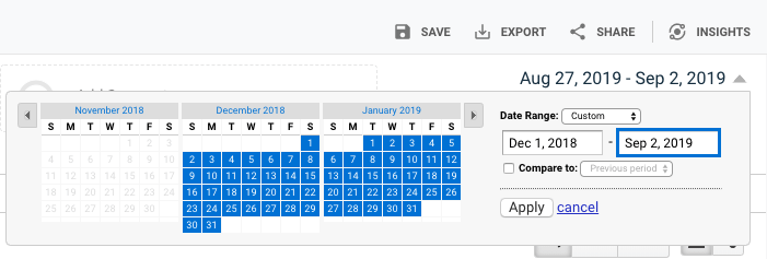
Choose a period to analyze
Past 7 days won’t do! I would generally look to include as much as 12 months back to capture seasonality shifts. Also try to exclude outliers like BFCM. So a good period would be from start of December 2018 till now.
Note:
If you have made an important change to your store during that period, focus on just the date range from that major event till now.
What counts as an important change?
You switched to a new theme/had a redesign, major navigation restructuring or speed optimization. Anything of that magnitude, aimed at improving user experience (UX) is an important change.
Filter out countries you don’t serve
Is there traffic to your store from countries you don’t ship to? Filter them out. This will leave only your potential customers in the data. You care about serving best these first, all other second.
Once you’ve constrained the data in a general way, it is time to get one step more specific.
2. How to spot outliers in the sea of data?
Almost every table report has options in the top right corner (below the graph) where you can switch from table to performance view. (That’s the icon looking like a sign post, with signs pointing left and right).
When you click it you can compare the items in the report based on performance. Like this:
You’ll use mostly this data view to check how your different traffic sources, devices, device platforms, browsers and pages perform across Bounce Rate, Conversion rate and Revenue for your store.
When is it worth focusing on a specific data point?
You’ll inevitably spot outliers that have high volume of traffic, but underperform. This is where your store is leaking money. But not all failures impact your store in a meaningful way.
A rule of thumb would be to disregard marginal items. A browser that is used by less than 0.5% of your traffic? Skip it, you have more important issues to take care of.
Pay attention to the top 1-2-5-10 results, depending on the percentage they comprise. As soon as you go below 2%, disregard, unless you can group these datapoints with other marginal ones by a unifying criterion. Confused? It will become clearer in a moment.
3. Start looking at specific reports to answer important questions
Note: The reports you are going to see are for a single month, because that particular store had recently undergone a major theme change and restructuring. These changes invalidated previous data. Leaks are in new places now. Hence the new leak analysis.
Visitors on which platform leak money the most? Mobile, desktop or tablet?
To answer that we need to look at the question from multiple angles.
1. What platform bounces the most?
To answer that, Go to Audience > Mobile > Overview
From the rightmost dropdown, choose Bounce Rate.
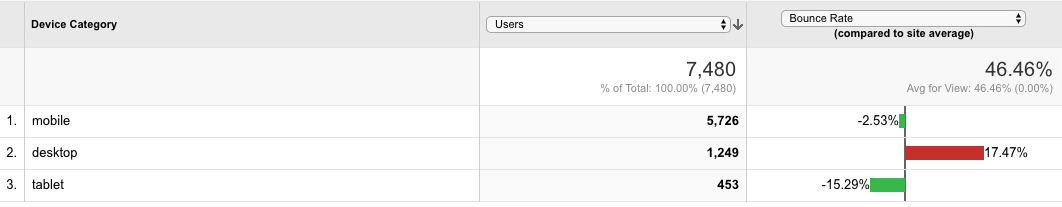
How to read this?
In that particular case, contrary to common e-commerce stats, desktop visitors to that website bounce more than mobile. Could it be they don’t find anything to make them click and explore? Where mobile visitors are used to swiping up and down (and as a result seeing most of the page), desktop visitors wander around with their cursor, sometimes missing "below the fold" content. Further research is needed to prove that’s the particular case here.
2. Which platform converts better?
Next, from the rightmost dropdown, choose Ecommerce Conversion Rate.
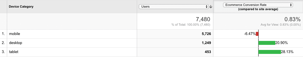
How to read this?
Despite the fact desktop visitors bounce more, their platform converts better than mobile. This suggests that mobile usability of the website is worse, despite the lower bounce rate.
3. Which platform brings the most revenue?
Now, from the rightmost dropdown, choose Revenue.
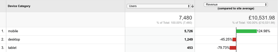
How to read this?
Despite the sub-average mobile conversion rate, visitors are still willing to give the website a chance. They are ordering the most.
The sheer volume of mobile traffic, combined with a less than average conversion rate hints that the majority of the store’s revenue is coming from mobile. How much? Let’s check:
Click on the pie chart icon, above the table and to the the right.
Then, from the rightmost dropdown named "Contribution to total", select "Revenue"
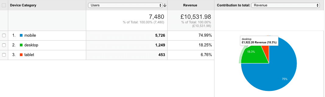
75% of that store’s revenue comes from mobile. In such case, since the mobile conversion rate is below the store average, it makes the most sense for all the tasks that target mobile improvement to be prioritised above desktop and desktop improvements to be prioritized above tablet improvements.
Your numbers may be different, which may lead you to a differently prioritized platform list.
Ok, we know Mobile is the biggest money leak. Let’s dive deeper!
Through which mobile browsers the store leaks money the most?
Answer to this question is provided by answer a few more sub-questions:
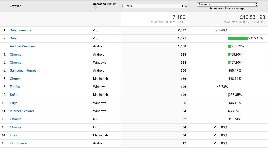
1. Which browsers bounce the most?
Go to Audience > Technology > Browser & OS
From the rightmost dropdown, choose Bounce Rate.
You’ll get data similar to this one:
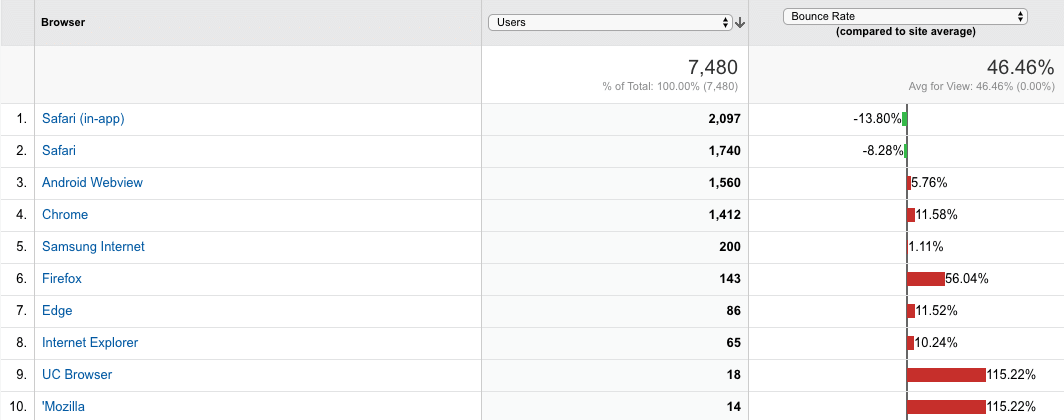
What does it say?
The website performs the best for Safari users (1,2). Their bouncerate is below average, which is good. From the report above, browser testing needs to be performed on Android Webview browser(3), Chrome (4) and Firefox(6). Maybe there is a bug that makes the people who use this browser bounce more than needed. Same for UC browser, but the percentage there is negligible. Samsung browser (5) has a negligible shift from the average and doesn’t need further investigation.
2. What browsers convert the less than expected?
Now, from the rightmost dropdown, choose ecommerce conversion rate.
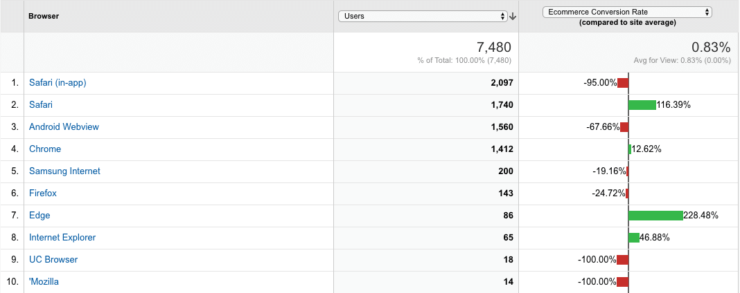
Wha does that report mean?
Conversion rate on Safari(2) is higher than Safari (in-app) (1); Android Webview(android’s in-app browsing) is converting less than average, too. This makes me suspect that people from social networks are not placing orders as much as the ones who open in a standalone browser. This could be confirmed by exploring traffic sources by conversion rate.
Notice how we are looking at the same facts, but from a different angle? Changing your point of view let’s you confirm or disprove your suspicions. Adding more detail to your understanding of the problem opens you up to new potential solutions down the road.
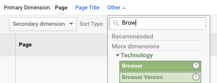
3. Which browsers bring in less money than expected?
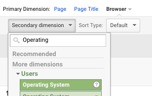
Next, from the rightmost dropdown, choose Revenue. Also choose "Operating System" from the "Secondary Dimension" dropdown (located above the Browser label).
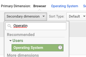
With this we are zooming in to see the browser/OS combo impact, so that a specific platform and browser could be targeted for further investigation.
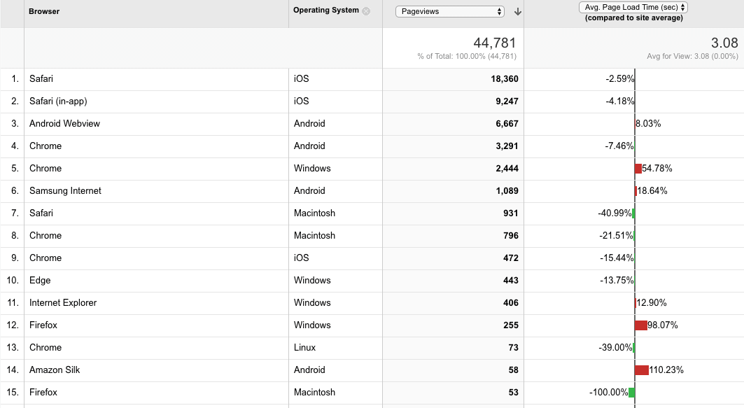
How to read this?
The previous insight ("in-app visits mostly don’t lead to orders") is repeated again on the revenue comparison screen. The store gets the most of its revenue from mobile—that Safari is running on iOS, not Macintosh (not a surprise). In-app Safari (1) may really be providing a buggy view of the site. Turns out only half of the initial 1412 Chrome users are on mobile.
So, up till now, we’ve discovered that standalone view of the website in a mobile browser should be compared with an in-app version (possibly following an ad link). This may also hint at a screen-size or device-specific issue. But what devices should you then test for leaks?
Let’s dive even deeper and go beyond the browser.
Through which mobile devices the store leaks money the most?
Go to Audience > Mobile > Devices
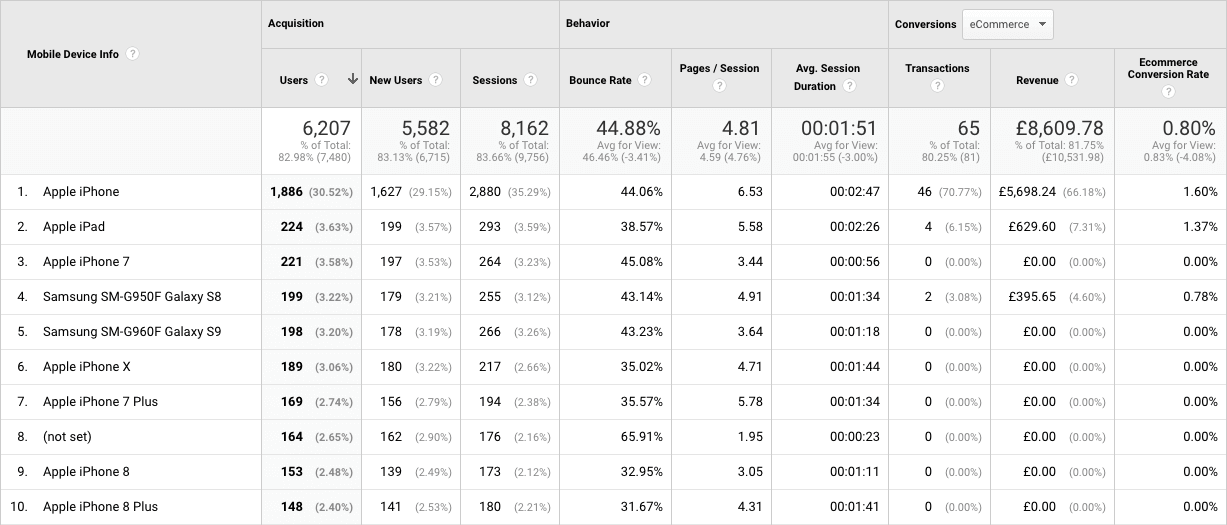
How to read this?
Yes, the iPhone (where the Safari and Safari (in-app) browsers run) (1) brings in the most revenue. But, given an average conversion rate of 0.83% for the past month, 264 sessions from iPhone 7 (3) should have resulted in 2 orders. The website should be tested on most of the devices operating at volume of 121 sessions or above. Why 121? With the current conversion rate that’s how many visits the store needs to get a single order.
💸 Quantifying opportunity:
How much revenue is leaking through the different devices actually?
Now that we’ve identified that phones with sessions above 121 should have resulted in a sale, let’s put a value to the missed orders.
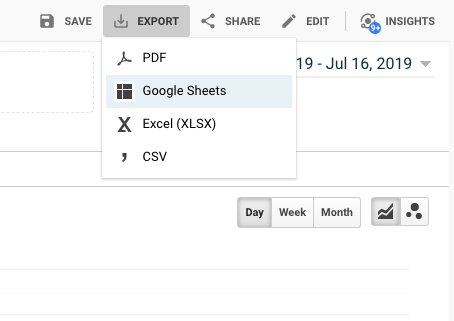
First, I exported the table data from the above view by going to "Export" → "Google Sheets" in the top right corner above the graph.
Then I removed everything but the underperforming devices.
Next I grouped devices with similar screen size and technology. iPhone 6s, 7 and 8 have the same screen size. 7 plus, 8 plus have same screen size and marginal performance difference.
Then I multiplied the number of the combined sessions by the store’s conversion rate and average order value.
Here is the spreadsheet with the result of the massaged data:
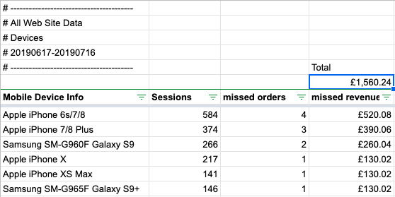
Estimates based on the store’s then conversion rate of 0.83% and average order value of £130.02.
Conclusion: The missed potential revenue is £1,560 a month or about £18,720 a year.
Let’s further narrow down what needs to be tested on the top leaking devices. Next question that should be asked is:
Are top money-leaking devices underperforming because of poor site speed?
The more specific the question, the trickiest data massaging becomes to get answers.
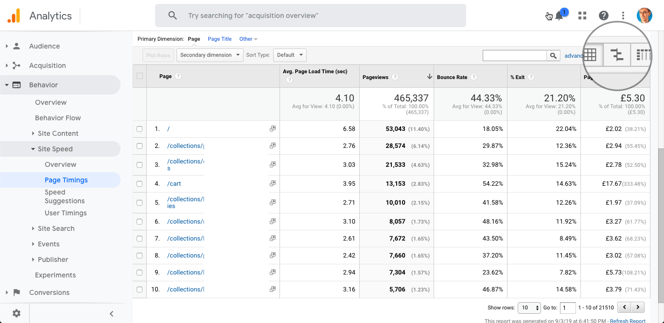
In that case, go to Behavior > Page Timings
Then, for Primary dimension, choose "Other" and select "Browser" from the list.
Next, click on Secondary dimension and choose "Operating System".
Now, you should have a report looking like this:
What does it say?
The average page load time is good (3.08s from top right). Apple devices load the site the fastest from the mobile devices present (1, 2, 9). This means that speed may not be the issue for them. Still, there are visitors who experience the website worse than others and that’s another point of leaking revenue.
Samsung’s Android browser(6), Chrome, Internet Explorer and Firefox on Windows (5, 11, 12 are underperforming in volumes that are costing the store money. Testing on these browsers and fixing the speed issues they have will lower the average page load time, will improve the Google page rank and will result in more organic traffic (and organic converts times better than social for that particular store as you’ll see later).
Sidenote: Compiling a list for device testing
If you want to hand-off the device testing to someone, here is how to create a list of browsers and devices that need to be inspected.
- From the Audience > Mobile > Devices get devices with most sessions and lest conversions (those used for quantifying the money leak)
- Prioritize the list based on the findings about speed/conversion performance
Combining the above evidence, a device-based speed test prioritization list comes out:
- Samsung Galaxy S9/S8 with Samsung Internet browser
- Samsung Galaxy S9/S8 with Android Webview
- Samsung Galaxy S9/S8 with Chrome browser
- Samsung Galaxy S9+/S8+ with Samsung internet browser
- Samsung Galaxy S9+/S8+ with Chrome browser
- Samsung Galaxy S9+/S8+ with Android Webview
- Apple iPhone 6s/7/8 with Safari in-app
- Apple iPhone 6s/7/8 with Safari
- Apple iPhone 7/8 Plus with Safari in-app
- Apple iPhone 7/8 Plus with Safari
- Firefox on Windows
- Internet Explorer on Windows
I bet that testing first on 1, 2 and then 7,8 will uncover the most issues.
Ok, we are done with devices. From the evidence above you can compile a list of tests to be performed. You can examine speed of loading, look for any glitches and visual bugs. The discovered issues are the holes, through which the leaking happens. Patch them!
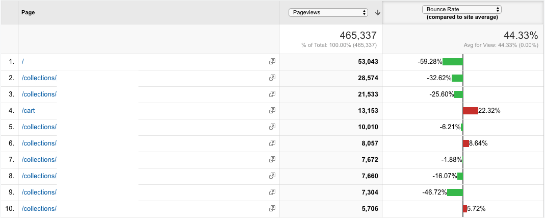
Which are the most problematic pages that need to be checked on the leaking devices?
To answer that, go to Behavior > Site Speed > Page Timings
Use "Page" as a primary dimension.
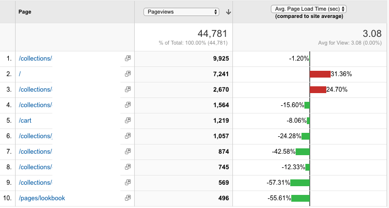
Interpretation:
Homepage (2) and one of the collections (3) are underperforming. These pages need to be checked on the devices listed above. Also, examine further for elements that don’t need to be there. Getting their page loading speed to the baseline would improve the pages’s conversion rate by about 10%.
Sidenote: why are these pages underperforming?
A collection page may have too many items per page AND Quick View turned on. Home page may have too many scripts, slideshows, banners, featured products, bestselling products... all that with Quick Shop on top is a recipe for sluggishness..
To recap: so far we’ve examined platforms, browsers and pages to spot leaks.
Let’s examine how the source of traffic influences visitor behavior.
Which visitor acquisition channel leaks money the most?
Go to Acquisition > All Traffic > Channels
Click the sign post button.
Select ”Bounce rate” from the dropdown.
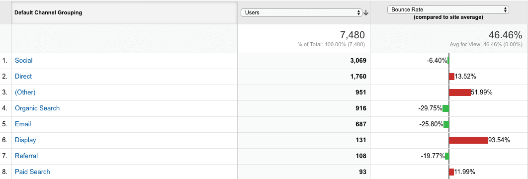
What does this say?
Social(1) traffic is the most. They are eager to explore. Direct (2) traffic, people who either typed the store’s address directly or are coming from somewhere with privacy settings that inhibit tracking, seem like they’ve expected something else. Potential context mismatch. Other(3), in that case, bundles up traffic referred back to the website from some of the Shopify apps they are using and anything else that Google Analytics couldn’t assign to other groups. Needs to be explored further and cleaned up. Organic search (4)— people coming from Google, Bing, Yahoo and so on. Here it gets interesting—people coming from search are usually in the shopping state of mind, so they explore more than the rest.
Email—people coming as a result of an email marketing campaign. Looking at the bounce rate of channels by performance, it is clear that the Display channel (display ads on the google ad network, outside of search results) is definitely not working. What could be done here—better define the channels, so that there is no "Other", also some of the referral traffic is actually coming from email, but is poorly tagged. Potential leaks—2, 3, 6, 8 and, surprise, surprise 1 (Social). Mostly because we’ve already identified that (in-app) browsing performs worse conversion- and revenue-wise, but they are willing to explore.
Let’s change the angle.
What channels convert less than expected?
Choose "Conversion rate" from that second dropdown.
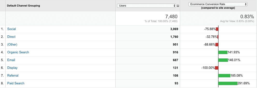
What does the data say?
Organic Search, Email, referral and paid search are the channels with highest conversion rate. The store owner should definitely double down on them to increase revenue.
Leaking: Social, Direct, Other, Display.
Which channels contribute to revenue less than expected?
Now choose "Revenue" from the second drop down.
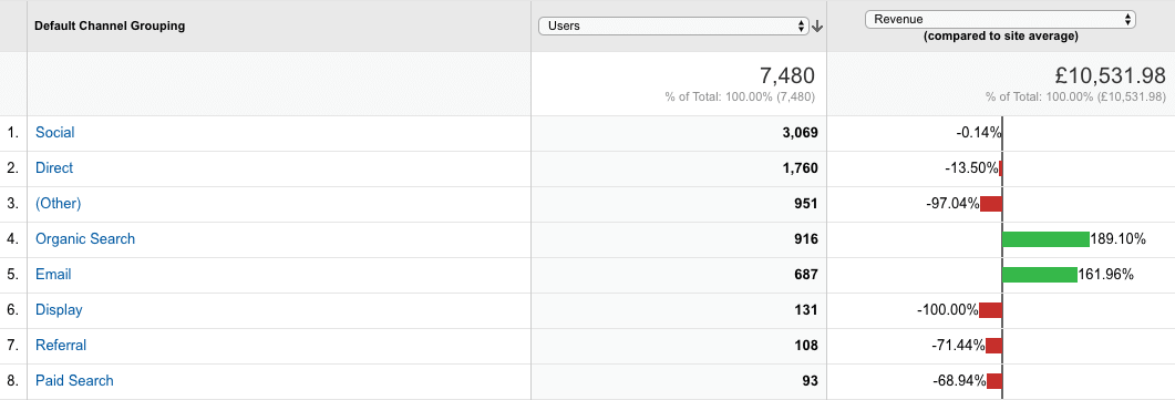
What are we seeing here?
As before—Organic Search and Email are the biggest revenue drivers for the store. That isn’t to say other channels don’t bring money, they just perform way below the average for a traffic channel on that store.
Display ads, as a prominent leak, shoud be cut for now. "Other" needs to be redefined. Referral and Paid search need optimization. The reason I’m not quantifying these leaks now is because of my specialization—I do on-site conversion and speed optimization. The data shows that these channels need the attention of an SEO specialist (who is going to work on the backlinks to the store) and a Ad expert (to fine-tune the targeting and copy of paid ad campaigns).
Now that we’ve gone through the channels and identified leaks there, let’s see when does the store leak the most visitors—when they first land on it, or when they return?
Which user type leaks more revenue?
In other words, is the store making more money from New or from Returning visitors?
To answer that, let’s start by going to Audience > Behavior > New vs Returning
Pick "Revenue" from the rightmost dropdown.
Now click the performance comparison button. You’ll get a view like this:
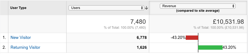
What does this say?
The store is definitely making the most of its revenue from the Returning visitors, which are less than New Visitors.
Want to know how much?
Click the pie chart icon (top right above the dropdowns).
Select "Revenue" from the "Contribution to total" dropdown. You’ll end with something like this:
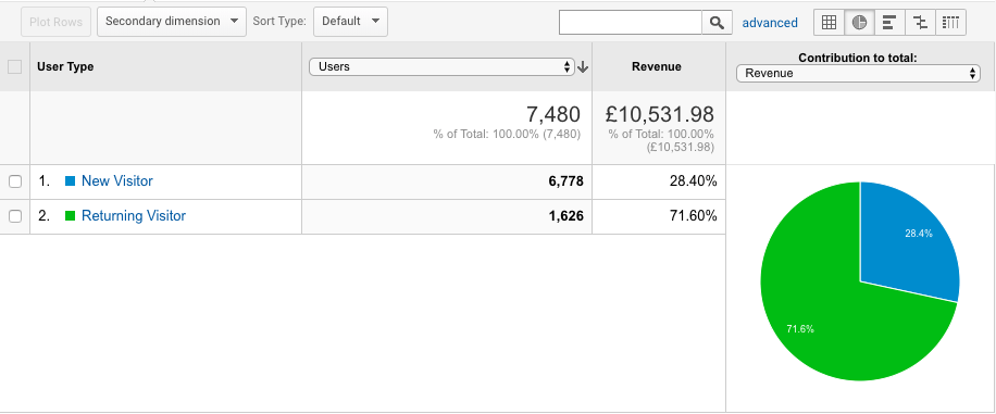
What does this say?
The data confirms the hypothesis—the store is indeed making around 70% of its revenue from 20% of its visitors. 80/20 rule in practice :)
There is a potential opportunity there. What if a bit more from the New visitors could return?
How does the conversion rate of returning visitors differs from new visitors?
Click the grid icon. You’ll end up with an overwhelming table like so:
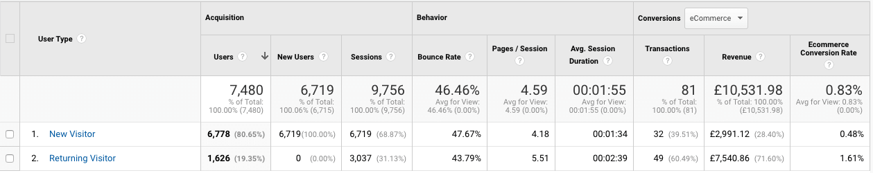
Notice the different conversion rates for New and returning visitors. Returning visitors are 3.35 times more likely to convert than new visitors. This means that most people don’t buy from the first visit to that store. One of the marketing goals then, should be to help them return. If they are brough back their chance of ordering triples.
Let’s quantify the opportunity.
💸 Quantifying opportunity:
How would the store‘s revenue improve if just 10% more people came back to the website?
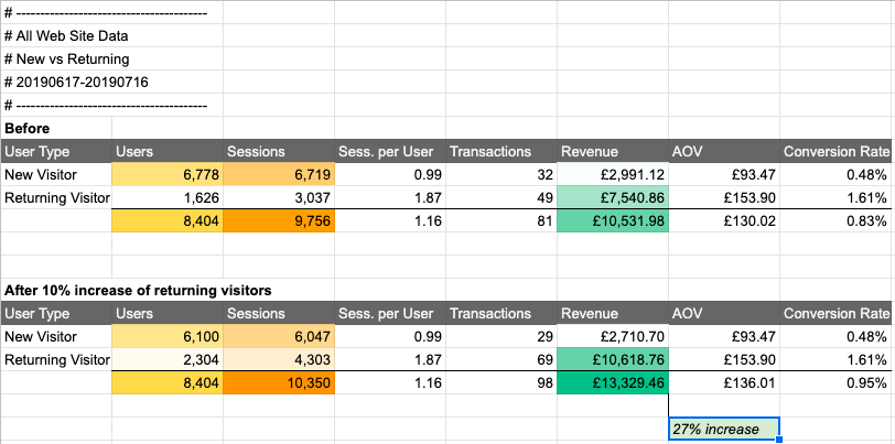
Not only new visitors buy at a lower rate, but they also have low average order value.
Returning visitors come around 2 times to the website.
Say the store owner finds a way to help just 10% of their first-timers to return to the store (yellow cells).
That would mean around 41% increase of returning visitor sessions (light orange cells).
As returning visitors have bigger impact on the business, this small (and achievable) shift—re-engaging just 10% of the first-time visitors—will result in 27% more revenue (green cells), while keeping the same AOV and Conversion Rate. When achieved that would bring around 34,000 GBP more per year.
Why do I keep on insisting that’s achievable?
Capturing new visitors in the store’s email list will put them in a high-converting channel. Retargeting them on social could also be of benefit. Incentivising them to join the email list could indeed convert between 5 and 20% of the new visitors into subscribers.
To recap: we’ve looked how different platforms, browsers and devices leak money. You saw the contrast in conversion rate between new and returning visitors.
Now, let’s look at the funnel fall-off rate. This will tell us where in visitor’s journey they stop.
At what step of shopping behavior do most of the visitors stop?
Go to Conversions > Ecommerce > Shopping Behavior
Don’t see Shopping Behavior as a report? Here is how to enable it. As you enable this now, you need to let some data accumulate. Skip this section.
On the Shopping Behavior report you’ll see a screen like this:
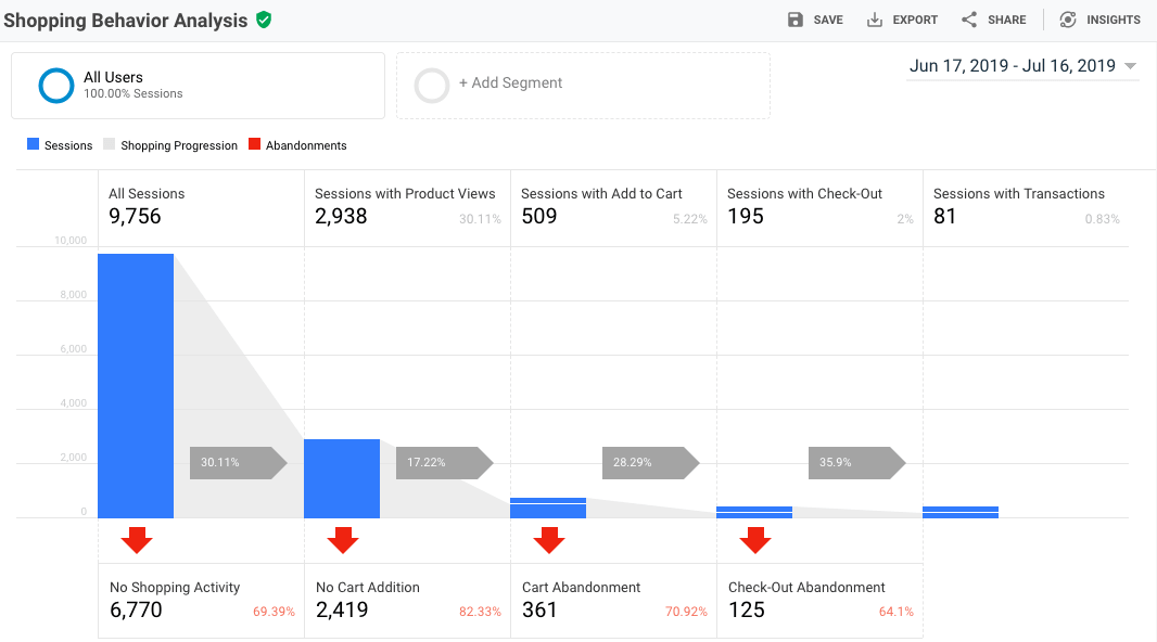
What does the data say?
People are leaking from every step, and that’s normal. The problem here are the huge percentages at which they leak.
Based on the abandon rate at each step , here is a list in what order different page types should be further investigated for that particular store:
- Product pages need the most attention —80% of the traffic is lost there
- Cart page—70% and closer to the end of the funnel
- Home page—gets the most traffic
- Collection pages
Now we’ve reached the end of what Google Analytics could tell us about the leaks in a Shopify store.
Sidenote: Why can’t we go deeper than that?
Discovering per page elements that make people bounce is outside the scope of this guide. Tools like heatmapping, visitor recording and timely pop-up polls could uncover what exactly is the friction point on every step. This is information Google Analytics as a tool can hardly give you, as it focuses on the bigger picture. Use HotJar/LuckyOrange/CrazyEgg to explore in-page visitor behavior further.
Bonus: Causes for funnel step abandonment
Even though we can’t get more data from Google analytics about the per-page issues, here are some hypotheses of what might be causing the high percentages of funnel leaking:
70% of the people who visit that website leave without viewing a product page.
This means what they see on the collection pages is not enticing enough to make them check the product itself OR that they can’t find a product that they want. This points at two potential issues—one is with navigation—are the products organized in a meaningful way? Could people filter products quickly to get to what they want? The second potential issue is with the product thumbnails—are people able to imagine themselves in these clothes?
82% leave a product page without adding to cart.
This means something discouraged them from even considering buying this product. They have objections that need to be uncovered and answered on the product page with additional information. This way they’ll be able to justify the asking price having convinced themselves in the value of the product they would be getting. This could happen with better sizing info, better material description, better description of occasions when such a garment could be used, mentioning of the benefits of wearing such a piece of clothing, stating explicitly money back/return and shipping policies. All of this aims to emulate the experience of asking a store clerk the same info.
70% abandon the cart without starting checkout.
Even though they were considering buying the garments, something discouraged them in doing so. This may be lack of payment information, lack of shipping info and unclear shipping costs upfront. If the order value is high, the shipping cost uncertainty gets higher, too. Hiding the postage rate in the checkout stops people from starting the checkout. People are discouraged from entering personal details only to uncover a shipping number too high on the next step.
64% abandon the checkout.
This means they have really decided to purchase, but something stopped them. There may be unnecessary friction in the process (optional checkout fields, asking for too much info) or outside distractions. People are people—they forget passwords, misplace credit cards, try to bundle orders with friends and end up waiting for them to confirm their part of the package and so on. Timely (and definitely more than one) abandoned cart reminders can return people from the land of distraction. Also people who have put a certain product in their cart should be notified of any promotions about it or products from the similar group later (Klaviyo helps you track that). Segmenting visitors by expressed interest in certain products and sizes could be used later to offer similar next collection items when store owner is ready to roll them out on the store.
💸 Quantifying opportunity:
How would the revenue improve if abandonment in the funnel is reduced?
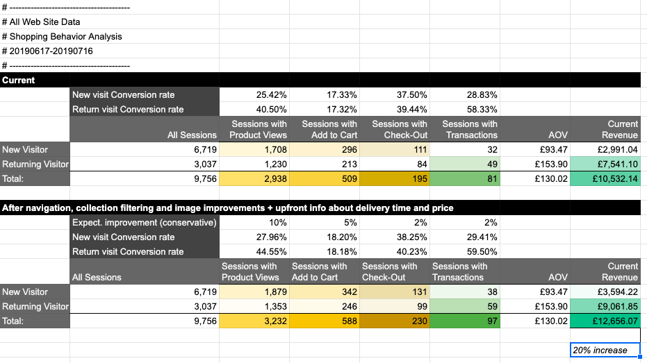
Knowing the average order value of new and returning visitors, we can now look at their different behaviour in the sales funnel.
Improving the browsing experience (navigation, collection filtering, speed, informative thumbnails) could conservatively help 10% more visitors get to a product page. Upfront shipping info on the product page with expected delivery times and prices could increase add to cart rate by 5%.
Providing a shipping calculator/fixed shipping info on the cart page could increase visitor confidence by 2% so they can start the checkout. Since shipping is no longer a surprise, 2% more people will complete the checkout. Note that these are percentages based on the amount of people from the previous step who managed to move to the next one. Also, the percentages are fairly conservative, as the browsing improvement impact is expected to be way higher for new visitors, who are also of higher quantity to the website.
So, based on all of that, a revenue improvement of about £24,000 per year is highly likely for that store.
And that’s a wrap!
That exhausts basic funnel leaking opportunities to be discovered with the help of Google Analytics.
If you followed the guide so far and thought through the examples you should have spotted money leaks in your store. You have ideas where to focus your resources for the next month or so before you start amping your ads and email campaigns for BFCM.
You should be done with that type of analysis by the end of September
Fix this before BFCM. Better by start of November. Actually, as mentioned in Blend’s BFCM preparation calendar checklist, September is good for analysis and planning, October is for clean up (and leak patching) and November is for implementation, test and launch of your campaigns.
Remember—during BFCM noise is higher, ad prices go up, people are swarmed with offers. Once they reach a friction point on your site… they’ll get to next offer in their feed or mailbox. You rarely have a second shot in the same BFCM window. Better start planning and optimizing now.
Need help getting your head around this leak thing?
Have questions or too busy to analyze the data yourself?
Either way, contact me on rumen@rumendimitrov.com